The Herschel 400 Astronomical League Project is underway
It’s not too late to join. We are about 30 objects into the Herschel 400. Hope to get another session in soon. Please subscribe to the YouTube channel so you get notifications on LIVE STREAMS.
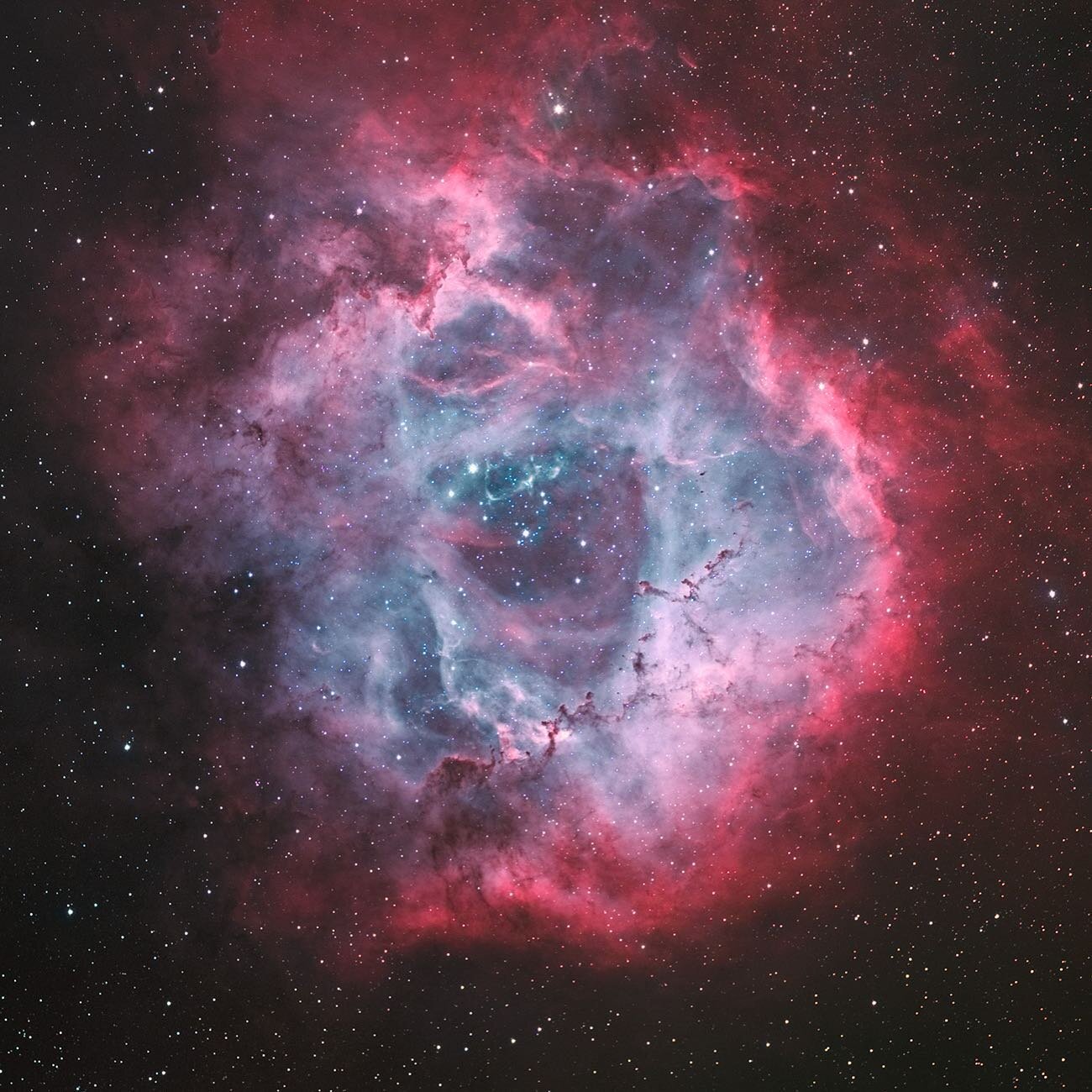
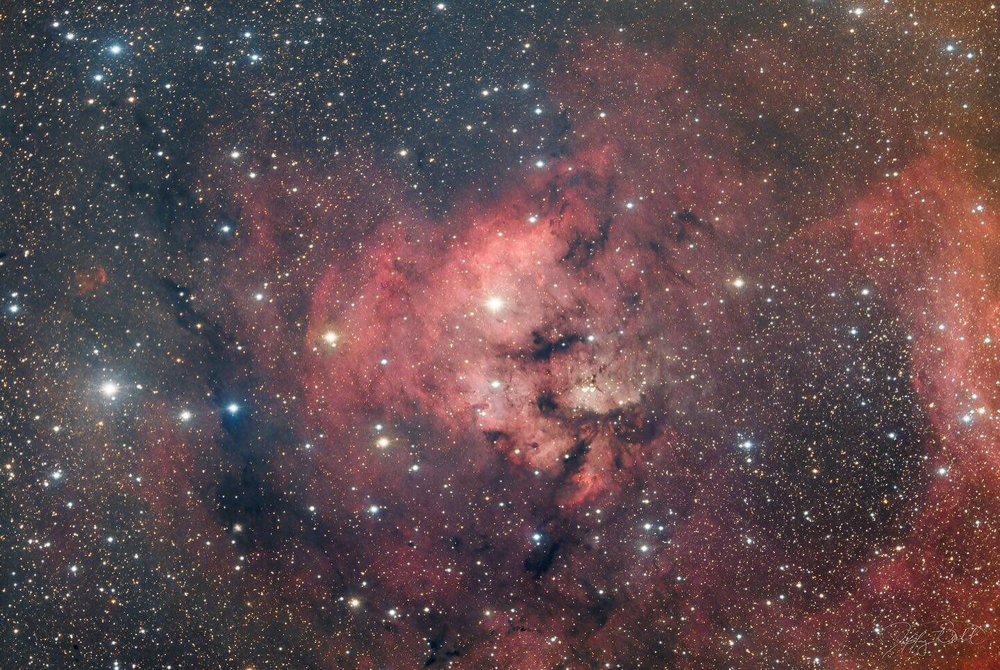
Angels in Monoceros: The Monoceros M2 Complex
The Monoceros R2 molecular complex (often shortened to Mon R2) is a massive giant molecular cloud and one of the nearest active star-forming regions to Earth. It's a dynamic stellar nursery embedded in dense gas and dust, where new stars—particularly massive ones—are actively being born.
Key Facts
Location: Southwestern part of the constellation Monoceros (the Unicorn), near the border with Orion. It's part of the larger Orion-Monoceros cloud complex.
Distance: Approximately 2,400–2,700 light-years (around 830 parsecs).
Size and Structure: The main dense core is relatively compact (a few light-years across), but the overall molecular cloud and associated nebulae span a wide area—reflection nebulae alone stretch up to about 2° in the sky. It's situated well below the galactic plane, which makes it stand out in certain observations.
Age and Activity: Star formation here began roughly 6–10 million years ago. It hosts an OB association (young, hot, massive B- and A-type stars) that illuminates surrounding dust, creating prominent reflection nebulae with bluish hues. There's also significant emission from ionized gas (red glows) and dark nebulae that appear as shadowy silhouettes blocking background light.
Notable Features:
A central hub of massive star formation with embedded clusters, molecular outflows, and HII regions.
Infrared observations (like those from VISTA or 2MASS) penetrate the dust to reveal hidden young stars and protoplanetary disks.
It's a key site for studying early stellar evolution, variability in young stellar objects (YSOs), and the interplay between massive stars and their natal clouds.
The most famous and photogenic part of Mon R2 is the region around NGC 2170 (the Angel Nebula), a striking reflection nebula with wing-like dust structures, glowing blue from scattered starlight, mixed with red emission and dark lanes. Wider views of the complex reveal a richer tapestry of colorful gas, dust filaments, and star clusters.
Credit: GROK 2/28/26
Click on image for larger view.
New Astro Camera: OM-3
Join me for a LIVE conversation about this new astro camera coming to the market. Is this the best option for you? How does it compare to other options? https://www.earthandskyphoto.com Correction: when discussing Bulb mode with Canon, I incorrectly said it had a limit of 30”. I meant to say manual exposure has a max of 30”. In bulb, you need to use a remote control or app for exposure time control. The problem is you can’t set exposure time for stills in the camera menu. I was made aware that Olympus no longer owns the OM system. It is owned by Japanese industrial Partners, a private equity firm. For content on the OM-3 for astrophotography, please see Ben Chapell’s Narrow Band channel. https://youtube.com/@TheNarrowbandChannel?si=GcWY-BM9skG9LPhY
Cutting Room Floor

Images make the cutting room floor for many reasons. While constructing this website I revisited many of my images from the past 5 years. One in particular has haunted me, this dramatic sunset from the Mittens in Monument Valley, UT. It was during the Natalie and Alain Briot Navajoland workshop on March 14, 2004. The moment was one I will never forget as it was host to the most dramatic sunset I have witnessed to date. I had been working on the Mittens Panoramic composition, which was 180 degrees from the sunset. Moments after the light in the east had faded on my composition the sun decided to step it up a notch to this incredible display of intense light. That is what I remember about it the most...the INTENSITY. You could almost feel the heat of the moment. It was very invigorating. In my hands was my relatively new Canon 10D. I was still learning the ins and outs of the system, but that isn't what ruined the technical execution of this image. It was a simple matter of violating the 1/focal length rule for exposure times. My focal length on this composition was 40mm and my shutter time was 1/10 of a second. Too long to be hand held and there is a bit of softness on the image to ruin a high quality print. I also left the ISO to 100 which could have been increased dramatically to shorten the shutter speed. But it all seemed to happen so quickly, which is why we really need to be well versed in all of our camera controls. Another problem I had with this image is that I really struggled with the color balance. Bringing some new techniques, software, and a better-trained eye, I decided to take another run at processing the image today. Most of the work was performed in Light Room 2.5 with some tweaking in PS4. Even with all of this, the image would be very challenging to print well as the intensity of the color and light are difficult to translate from the monitor to the printer. I have added no saturation to the image at all...like I said...it was intense. I love the image for what it does for me...recalling an incredible moment in time of intense light at a beautiful location. Enjoy the image and prepare for your next moment of intense light in the landscape. Take care.
If accumulating bad photos means anything...
I have read references to some insight by Ansel Adams about not being a good photographer until you have taken enough bad images. I think he also said that 12 quality images a year is a good crop. The website "redo" has provided an opportunity for me to step back and really evaluate what are "good" images. The process is not entirely pure as my bias has many influences that don't necessarily have anything to do with the quality of the image. One strong bias is the difficulty in either acquiring the image or in processing the image. The harder one works on acquring or processing an image the more likely that image is going to make it into the portfolio. On the relaunch of my website I have thrown out some images that have taken many hours of my time to get just right. Upon further review these images simply don't reflect my artistic presentation style or meet my quality standards. This is a good thing! I am now embracing the current tag line "less is more" when it comes to portfolio construction and web presentations. I hope you enjoy the images in the gallery so far and I look forward to adding quality images to the collection over the next few months. Take care and Happy Thanksgiving.
I love photography!
Winding down vacation and all I can say is that I waited way too long to get the camera out and go photographing. I did finally spend some time the last two days photographing at Brookgreen Gardens and in the morning surf at the beach. It has been far too long since I engaged in some landscape photography. Man did I have fun! Simply being in the moment, exploring beautiful Brookgreen Gardens and looking for compositions...it was marvelous. The thrill of the hunt, looking for that great moment of wonderful light and composition, and I think I may have found a couple of images to share with you. I can't wait to get home and work on some of the compositions in the digital darkroom. But even if I hadn't found a single composition, it was an amazing experience to simply be on the hunt again. Brookgreen is an amazing combination of gardens and sculpture. Being in the midst of wonderful fine art created even more momentum for my photographic pursuits.
I am trying to balance astrophotography and landscape photography and it may prove to be too challenging. But I am going to really take a stab at achieving the balance since I enjoy both so much and I believe the pursuit of one helps the artistic expression of the other. If it has been a while since you went out on the hunt for a great photograph, I encourage you to grab the camera and isolate yourself from the cares of the world and begin to look for those great moments of light and composition. I really hope to return to this area and explore Brookgreen more extensively. Stay tuned for images and more information and Happy Independence Day!!!
What size should web image be?
With the introduction of the "netbooks" and smart phones, I was curious to revisit the most common screen resolutions currently being recorded by web browsers and those data mining groups that do such things. One report I found lists 36% of surfers are using 1024x768 in January 2009, down a bit from 2008. Where is the move? To higher resolutions. The report only lists resolutions higher than 1024x768 and that percentage is 57%. But are we possibly seeing a move back to smaller screens? Do the data mining groups account for web browsing on smart phones? I know that I look at images on an iPhone, Macbook Pro, and a 24" Apple Cinema display. I have looked at the netbooks and can't say that they catch my fancy at the present time. A quick look at one of the HP netbooks (N270) shows it sporting a 1024x576 screen resolution. Will netbooks find a strong foothold in the marketplace? Another consideration for how large of an image to post to the web is how much of an image do you want your audience to view. I personally always want the entire image showing with no zoom effect. Why? I take great care on the entire composition of the image and want the image always viewed in its entirety. To me, posting a larger than 1024 image on the web would be like Ansel Adams only allowing you to view one of his prints from a distance of 6" away. There is a proper viewing distance for all images and one should consider that even for web presentations. Now I do understand that some browsers can re-size the image to fit the window, but I really don't want to rely on that effect 100% of the time. So at the present time I have chosen to post images with a long side of 1000 pixels with some modifications for portrait orientation. To me that hits the sweet spot of fitting nearly every screen resolution out there (93%)and presenting the image in its entirety to the viewer. So that is my take on proper image size in June 2009. I hope to revisit the issue as time passes to see where screen resolutions may go into the future.
Jeff's Blog
Join me on photography journeys from desert landscapes to deep sky wonders.


